Cracker Barrel unveils new logo after 47 years

Cracker Barrel has unveiled a new logo that drops the barrel and the man, part of a larger transformation plan to update its image and attract new customers.
The chain is also revamping its menu, commercials, and restaurants, angering some loyal fans who feel the changes are straying from its traditional roots.
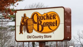
“Anchored in Cracker Barrel’s signature gold and brown tones, the updated visuals will appear across menus and marketing collateral, including the fifth evolution of the brand’s logo, which is now rooted even more closely to the iconic barrel shape and word mark that started it all,” the company said in its announcement.
Despite mixed reactions on social media, CEO Julie Felss Masino insists that the renovations are well-received, with positive feedback from customers.
The company is also facing financial challenges, including a $5 million hit from tariffs on imported products in its retail shops, but investors remain optimistic with shares up nearly 8% for the year.
Cracker Barrel unveils new logo after 47 years was originally published on wbt.com